
Color Grading in Adobe Premiere Pro 2023
In this 15 minute lesson, you’re going to learn everything you need to know about color grading in Adobe Premiere Pro. We’ll color correct and color grade the characters, the light, the set and the clothes.
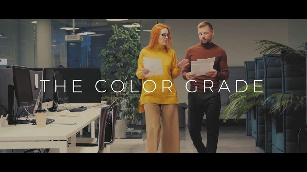
We will go from this:

to this:
in ten simple steps.
And watch until the end of this video to learn about the five key enhancements to make your color grading stand out even more.
Let’s get started!
Step 1 – Understanding Color
If we overlay our waveforms on top of our image, we can see that the waveforms represent the colors within the picture. Adobe Premiere Pro uses the HSL color model.
H means hue, which is basically the color that you’re choosing.
S means saturation, which means how strong or weak that color is going to be. At 0% it will be black and white. At 100% it will be very strong.
And L means lightness. So at 50% it’s normal lightness. 0% is black and 100% is white.
So below these sliders we have our color wheel, which also controls the hue, saturation and lightness. So the angle at which you have this marker controls the hue, how far you drag it out, controls the saturation. And this slider up and down here controls the lightness.
Step 2 – Storytelling Through Color
Each of these colors on the color wheel has a meaning. The meaning of these colors is highly subjective, but for the purposes of our video, we are going to choose the following colors to tell our story.
All great stories have a conflict or a problem that needs to be resolved. So what we’re going to do is we’re going to start off with two characters. Yellow will represent one character, our protagonist, to show that she is collaborative and open and Red will represent our other character to show that he is domineering and closed type character.
And as you can see, the overall lighting of the scene is a nice warm yellow color because these two people have just started working together and the conflict has not happened yet.
But as they continue to work together, the tone changes and we see the introduction of a green color. The lighting was once yellow and warm. It is now a more green hue which represents that the mood is changing and as a result, our protagonist in this hero shot, adapts also.
The color of her clothes changed to blue, and the overall color of the scene has a blue hue to it. This represents that she is now going from being collaborative with the other character to taking the other character head on. And there’s a separation there. That blue is opposite on the color wheel to the color red, which is the color that we’re using for his character to show that he isn’t willing to evolve, that he’s staying the same.
And this sets up the conflict for our story. As you’ll see in the following sections, it’s really important to make these decisions at the very start because this affects how you color grays the entire sequence.
Step 3 – Choose the Color Workspace
So we’ll go to Window > Workspaces > Color and then Window > Workspaces > Reset to Saved Layout. And we’ll go over to our project panel and open our video bin.
And in here, just looking at the footage, you can see that in the properties panel. It is 4K footage. It is best to use the highest resolution footage when doing color correction and color grading, but ultra HD and HD is fine also.
Step 4 – Basic Correction
Okay. So we’re going to click on Basic Correction in our Lumetri Color panel. And before we begin, we’ll switch on our comparison view. So if you click and drag that down, I have it already. So I’ll just click cancel and there it is. So that is now switched on.
We will then make our program window larger so that we can see the images more clearly side-by-side. And we’ll click on ‘Shot or Frame Comparison’ so that we can see the changes before and after. Okay, so first let’s modify our blacks, which controls the darkest parts of the image. So I’ll drag that to the left because it’s a little bit faded. And as you can see, it’s now color corrected on the right. And on the left is the before, which is still faded.
Next, let’s work on our whites, which control the brightest parts of the image. Let’s drag that out a bit to the right to give it more vibrance, then let’s work on our shadows which are the point between the blacks and the mid-tones. We’ll drag that to the left to bring some more detail back in and the highlights which are between the mid-tones and the whites. Let’s drag that to the right.
Contrast, I’ll just increase a little bit. And exposure, I usually leave this the same because when you drag this up, as you can see, it makes it look overexposed.
As you can see, if you decrease the saturation to zero, it’s black and white. And if you go up to the very top, the color has become too strong. So I’m just going to desaturate it a tiny bit to 91.3%.
I’ll turn off my comparison view then in order to get the white balance of the scene, I will click on a white element within the scene, like this piece of paper to automatically adjust the color in the scene to the right temperature of the light in the room.
And lastly, in line with our plan for this scene, I’ll increase the temperature to make it warmer to reflect that initial effort at collaboration. There is a bit of a green hue to the scene, so I’m going to drag the slider right into the middle here to remove that green hue that will come at a later stage in our storyline.
Step 5 – Fix the Set Colors
Not only is it important that the clothes of our actors match our color palette, but also the set and the furniture within it. And as we can see, the pink furniture here does not match anything that we have planned in our color palette.
So what we’re going to do is, we’re going to mask this furniture and then we’re going to color adjust it to make it fit our storyline. So with the program window zoomed in at 200%, I’ll select my clip, go to the effect controls panel. Let’s quickly resize our windows here and let’s drag in another Lumetri Color effect onto our clip that will focus just on this furniture.
Let’s click on our Pen Tool and create a mask around the furniture. The mask doesn’t need to be exact on this furniture because the color of us is pink and it’s very distinct to the background colors that are around it. Let’s speed this up a bit.
Then with our color picker, let’s select the pink and we can click on the Color/Gray selection box here to see what is selected and what isn’t. So the white elements aren’t selected yet, so we’ll choose our add color picker here and keep on refining it. You can also use these hue saturation and lightness sliders to refine your selection, and once we’re happy with our selection, we’ll scroll down to the correction section of our Lumetri Color panel and we’ll change the settings here to change the color and the brightness to make it much darker.
Once our selection is complete, we’ll track our selected mask backwards and this will mean that it will track the furniture as it moves in the scene.
Step 6 – Choose a Creative Look
Okay, so firstly, let’s click on our Creative panel and the Lumetri Color panel and then let’s go over to our project bin and we’ll open our adjustment layer bin and right click and choose New Item > Adjustment Layer Click okay to the warning message.
Then let’s drag that across into our sequence and in our effects panel. Let’s choose Lumetri Color and drag it up onto our adjustment layer. Then in our Creative panel that’s choose ‘SL Big’ as the look.
And as you can see there, this look suits our content. So I’ll drag our adjustment layer all the way across our sequence so that it is applied to every clip in the sequence. You can also modify the intensity but 100% is perfect for us.
Step 7 – Color Consistency
It’s important that all of the clips in our timeline are consistent in terms of the color. As you can see, when we go from clip one to clip two, there is a big difference between them.
So we need to do is, we need to select clip one, go over to our effect controls panel, copy our Lumetri Color and then go to our second clip in the timeline and paste the Lumetri Color changes to this clip also. This means that these two clips are now totally consistent and we repeat this across all the clips in the sequence. A quick way of doing this is Command + C on a mac or Control + C on a PC and then Command + V or Control + V to paste it onto the next clip.
Each shot may have different lighting, so it’s important to also color match the scenes within the sequence in order to make sure that they have similar color balance. The best way of doing this is to use our Lumetri Scopes. so I’ll go to Window > Workspaces > Reset to Saved Layout. And then we’ll go over here and we’ll go to Waveform Type > Luma and we’ll also switch on Parade.
So Luma has your waveforms for the overall color in each scene and then the RGB Parade has the red, green and blue within each scene. And you can see there that the scene on the left is represented in each of these colors and the scene on the right is represented in each of these colors. And our goal is to make sure that they are a similar height between each scene. So then the color balance is consistent throughout. Let’s quickly do this for all of the scenes.
Step 8 – Fixing the Character’s Clothes
Similar to fixing the colors of the furniture on the set. We need to fix the color of one of the character’s clothes in order to show that his character does not evolve and change through the storyline, it remains constant.
So we need to introduce red into his clothes. And we’ll do it in a similar way to the way we did the furniture by masking his clothes, selecting the color we want to change using the color picker, and then modifying the color of it using our correction options.
Finally, we will track this color correction through the scene using our manual tracking because the colors are so similar, the automated tracking does not work.
Step 9 – Change the Mood through Light
So as we can see here, we still have our warm adjustment color applied to all of the clips. What we need to do is, we need to divide it up in order to have a change in mood in our sequence.
So we’ll use the Razor tool to cut it up at this point where we transition to a more blue color palette. We will then reduce the temperature of this adjustment layer to give it a colder feel, signifying that the mood of the story has changed.
We’ll then check each of the shots against this adjustment layer and make some minor changes until we are happy that all of them match the tone of the story. In the middle of our sequence, we have this intermediary scene where the mood hasn’t gone cold yet, but it is turning.
So a good color to use here is green because it sits in between red and blue on our color wheel, signifying that a change is happening. So what we’ll do is we’ll use our razor tool again to divide up the adjustment layer. And then with the adjustment layer selected we’ll add a green tint to this scene. We’ll also use what we learned in our previous section to turn the sofa green.
Step 10. Test Color on Multiple Devices
Once you’re completed your color grading it’s worth testing on multiple devices like a 4K TV, a mobile phone, and on YouTube just to make sure that the color is consistent across all platforms and that there are no issues.
Enhancement 1 – Black Bars
Okay, now that our color grading is complete, it’s time to do a few enhancements that will make it stand out even more.
First of all, let’s create a new adjustment layer and let’s drag is on top of the other adjustment layer that we have and we’ll drag it to the end of the sequence.
We’ll go to our Effect Controls panel and we’ll drag up our crop effect onto our adjustment layer, onto our new adjustment layer. We’ll crop the top 11.5% and we’ll crop the bottom 11.5%, and those are our black bars added.
We can then reframe each of our shots within these black bars to make sure that we have perfect framing for each scene.
Let’s speed this up.
Enhancement 2 – Time of day Continuity
So as we can see here, it’s still quite bright outside, the shots before this shows that it’s dark outside. So what we need to do is we need to make these windows look darker. So we’ll go to our effects panel, we’ll drag Lumetri Color up onto our clip, we’ll then use the Pen Tool to mask each of the windows and make them darker using exposure.
Finally, we’ll track these changes as the scene moves.
Enhancement 3 – Add a soundtrack
Choosing the right soundtrack is vital that it matches the tone and mood of the color grading. So let’s bring in this soundtrack here and we will shorten it to the same duration as our sequence.
Let’s listen to that to see how it enhances our sequence.
Enhancement 4 – Add a Sound Effect
So, as the mood of our sequence changes, we can add a sound effect to enhance this change. So we’ll drag and drop our sound effect in here. And as you can hear, it really punctuates that change in mood.
Enhancement 5 – Video and Audio Transitions
So we’ll go into our Effects panel and we’ll type in Dip. As you can see, we have Dip to Black here. We’ll drag it across to the start of our sequence and it gives it a smooth beginning along with the soundtrack. We’ll also add it at the point where the mood changes to show a transition in mood. We’ll add it to the adjustment layer also.
And finally, we’ll add it to the end of our sequence to both the video and the adjustment layers for a smooth ending. I’ll just make those a little bit longer by dragging the end of the Dip to Black effect further into each of these elements.
The soundtrack starts with a smooth crescendo, but we don’t want it to end suddenly, I’ll drag ‘Constant Power’ across onto the end of the soundtrack so that is fades out gracefully. We just make that a little bit longer similar to the video transitions above.
Our conflict is now set up, ready to be resolved in the rest of our story.
Thank You
Thank you for watching. I am an Adobe Certified Professional in Digital Video using Adobe Premiere Pro. If you would like to see new lessons as I post them, please subscribe to my YouTube channel.
And if there’s any particular skill you’d like to learn in Adobe Premiere Pro, please leave it in the comments and I will put it on the list of upcoming lessons.
Summary
The sections of this ‘Color Grading in Adobe Premiere Pro 2023’ lesson include the following:
00:00 – Introduction to Color Tutorial
00:27 – Step 1: Understanding Color
01:18 – Step 2: Storytelling Through Color
02:54 – Step 3: Choose the Color Workspace
03:23 – Step 4: Basic Correction
05:29 – Step 5: Fix ‘The Set’ Colors
07:19 – Step 6: Choose a Creative Look
08:10 – Step 7: Color Consistency
09:50 – Step 8: Fix the Character’s Clothes
10:43 – Step 9: Change Mood through Light
11:50 – Step 10: Test Colour On Multiple Devices
12:06 – 5 x Enhancements to Make Your Color Grading Look even Better
Content Used In This Tutorial
Thank you yo these amazing content creators:
– Video by Jack Sparrow from Pexels – https://www.pexels.com/@jack-sparrow/
– Music by Lexin Music from Pixabay – https://pixabay.com/music/beautiful-plays-inspiring-cinematic-ambient-116199/
– Sound Effect by Rizzard from Pixabay – https://pixabay.com/sound-effects/cinematic-boom-6872/
Learn more about my online course Adobe Premiere Pro for Beginners – Professional Trainin